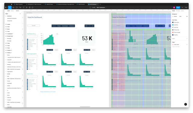
Crafting an Open-Science Analytics Dashboard for Bibliometricians

For this project, I worked as a senior Product Designer with a focus on UX research. The goal of the project was to design an analytics dashboard that would allow bibliometricians to perform open-science analysis. Overall, the project highlighted my capacity to innovate in user feedback sourcing, adapt designs to technical limitations, and iterate based on user requirements.

Discovery Phase

The journey began with conducting interviews with bibliometricians and key stakeholders to identify goals and achieve consensus on the dashboard's objectives. Balancing the limitations of DataCite's infrastructure and data capabilities with user stories and desired goals presented a significant challenge.

Idea Validation

Finding users for validation proved difficult, so I took an innovative approach. I posted a conceptual dashboard design on DataCite Roadmap via ProductBoard, requesting feedback on its potential utility and use-case scenarios. This yielded valuable input from nine organisations.

Design

Guided by the feedback, I commenced the design phase using Figma. This was an iterative process involving continual refining based on the insights obtained from the idea validation phase.

Design
Solution Validation

Solution Validation

Once the prototype was ready, I organised a technical walkthrough with subject matter experts, which included those who contributed use cases in the idea validation stage. The feedback was generally positive, but there was a demand for enhanced visualisation.

In response, I conducted a second round of targeted interviews focusing on visualisation design, exploring aspects such as dimensions, filters, aggregations, and measures to be included in the visualisations.

9

Organizations participated in idea validation

5

interviewees provided valuable insight for design

10

experts participated in the technical walkthrough